With literally millions of native mobile apps out in the world today, it’s increasingly difficult to stand out from the crowd—and an especially daunting task for smaller brands to rank among those top featured apps. But don’t be disheartened, because if you put the right effort and resources behind your product, it will show. Keep reading for five best practices for building and maintaining a world class mobile app.
1. Size Does Matter (Package / Performance)
Let’s be honest: if an app takes forever to download and install, the chances are also high that it performs sluggishly and drains your user’s device’s precious battery life. Given that people typically utilize only 3 to 4 apps on a regular basis, it needs to perform with maximum efficiency in order to be useful and valuable to users. Complex gaming apps tend to be on the larger size, which is to be expected; but if a simpler app ends up being excruciatingly large or cumbersome, chances are it will not succeed in today’s highly competitive market.
Takeaway: Keep it lean and clean. Intuitive design, file compression, and efficient coding all go a long way in ensuring your app runs fast and doesn’t annoy users by draining their battery.
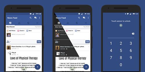 Swipe for Facebook is a lean and fast app.
2. On Lockdown (Security / Stability)
So you’ve done a good job marketing and getting the word out about your new app. People are downloading it. Once it has successfully made it onto thousands of user devices, it’s crucial that you sustain the trust of your users. This means ensuring that your app performs without crashing and that security is airtight, especially if storing personal information such as credit card info or passwords. With such large failures in consumer-related cyber security recently, it’s paramount to have high user confidence if you want your app to be successful.
Takeaway: Don’t take the cake out of the oven too early. Before launch, set aside plenty of time for QA and user testing to make sure the database is bulletproof and built to last.
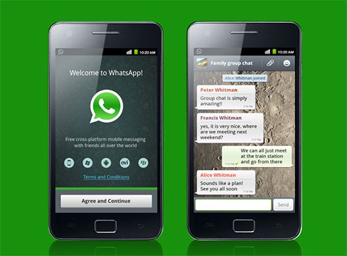 WhatsApp features exemplary security and as a result, has earned the trust of its ever-growing user base.
3. Smart AND Pretty (UX / Design)
They say beauty is in the eye of the beholder. The same rings true with mobile apps, and this one aspect can make such a huge difference for both developers and end-users alike. Take two apps that do similar things, comparing them side-by-side: One app looks dated, has confusing navigation, and hides functions that should be front and center. The other app looks more modern, is easy to navigate, and makes accessing the most useful functions a breeze. All other things being pretty equal, I already know which of those apps I’m downloading and using on a regular basis: the one that makes things easier to accomplish with less taps and confusion.
Takeaway: A positive user experience and a polished design aesthetic are what truly separate the good from the great. Spend plenty of time up front on wireframes and iterative prototypes, because they will save countless hours in development and beta updates.
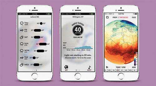 Dark Sky is highly regarded for its state-of-the-art usability and aesthetics.
4. K.I.S.S. (Focus / Simplicity)
We’ve all heard it: Keep It Simple, Stupid. It sounds easy, yet can be incredibly difficult to actually achieve. And unfortunately, too many developers don’t adhere to this sage advice. They try to cram everything into one screen, overwhelming the user and giving very little informational hierarchy. Or they try to include all the bells and whistles in the first version of the app, which results in blowing the budget and leaving little time or budget for quality testing; ultimately, you can end up with an unreasonably complex app full of bugs.
Takeaway: Do what you know, and do it well. Keep your focus on the bare necessities that bring the most value to the user, and improve upon them little by little.
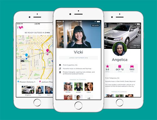 Lyft began as a basic ridesharing app and has added its robust featureset slowly over time.
5. Stay Awake (Trends / Tech)
Lastly, be sure to keep your eyes and ears open for emerging trends and technologies. That doesn’t mean you need to implement every fancy new widget or wild color scheme that comes along just for the sake of “being on-trend”. It simply means to stay aware of where the market is heading, and what brings the most value to users. Read blogs. Subscribe to newsletters. Check out your competitors. If you have the means, try doing some market surveys. Anything is better than nothing, so stay on your toes and be open to new things.
Takeaway: Just because you made a great app doesn’t mean it will remain that way for long. Stay current and knowledgeable of the market and what you can offer, only implementing new features and functions when it makes sense for your budget and your users.
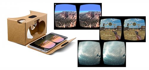
Google Cardboard takes the elite VR experience and makes it available to anyone with a smartphone.
Conclusion
With a plethora of mobile development tools out there – from basic to professional – and the saturation of software engineering positions, it leaves no question as to why there are so many apps with wide varying degrees of value to the user. Some apps function fine, but lack the visual punch that could make them great. Others look pretty and polished, but crash more often than not, rendering them almost useless. The trick is to find a balance and continuously improve upon it.


